Accessibility in UX design.
The objective of accessibility is that all products are useful for every users regardless of their physical and cognitive abilities.

What is Accessibility?
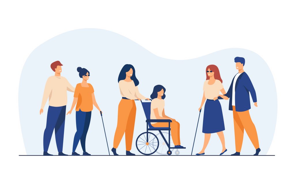
Accessibility allows people with various limitations to flawlessly understand and interact with the web or a product, just like everyone else. An estimated 16% of the global population experience a significant disability today. These include people with
- Vision Disabilities – Such as blindness, color blindness and low vision.
- Hearing Disabilities – Such as deafness and low hearing.
- Motor Problems – Such as reduced ability to use a mouse, slow response time and physical deformities.
- Cognitive Problems – Such as learning difficulties, issues with memory
An accessible design would help around additional 1.3 billion people to use a product effortlessly. There are diverse ways to improve accessibility of a website up to an extent.
Some Best Practices to Improve Accessibility
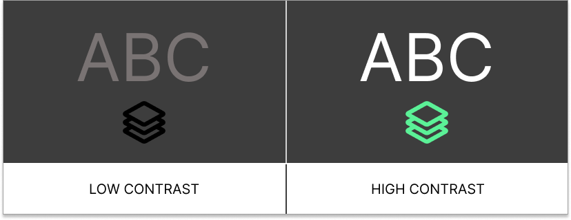
1. Readability and Color Contrast.

Designers must ensure that everyone can read and understand text content. Using sufficient color contrast, large enough fonts and icons and better clarity texts could improve readability.
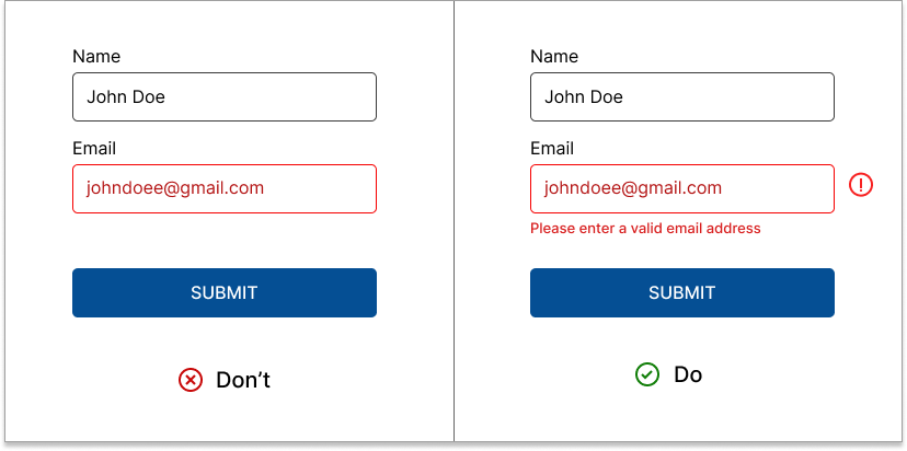
2. Don’t use color as the only visual cue

When you outline essential information just using colors, people with low visual acuity or colorblindness face difficulty figuring out what your content says.
Use labels, specific error messages, underlines, italics, icons, font weight, and size to make your message understandable for people with visual impairments.
3. Alternate text for images
People with low visual ability uses assistive technologies like screen readers to hear web content. Make sure there is enough description for images are provided for the screen reader or useful alternative text in <alt> attribute is included.
Alt text not only helps screen-reading tools describe images to visually impaired readers but also improves user experience and SEO.
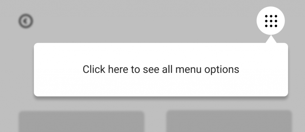
4. Reminders, Guided tour and Multiple Navigations


Users with cognitive disability may find it difficult to memorize data or to navigate to a specific page. Reminding them with important dates or tasks would help to enhance web experiences for people with cognitive disabilities.
Findability and clear navigations are part of good UX. Including guided tour and multiple navigations could help in improving overall user experience.
5. Keyboard friendly websites

Some users with mobility disabilities may completely depend on keyboard over mouse. They control and navigate the content using arrows , tabs and other keyboard keys.
Creating an orderly flow with keyboard accessible menus and buttons, along with visual indications of where the focus is, would refine the complete interacting experience for such people.
Conclusion
The web works well for all people irrespective of any disabilities. Building accessible products creates equality among users. Greater accessible websites not only allows wider audience to use a product, but also boosts the business scale.
It’s designers and developers responsibility to keep the neglected billions in mind and create user friendly digital products for all people!

