A guide for setting z-index
Hello geeks, this isn’t related to trending technology, but in fact, related to a useful traditional CSS property z-index. Yeah, I know it is not a new term, especially when you are a frontend developer.
Anyway, before we dive in, let’s look at what is z-index.
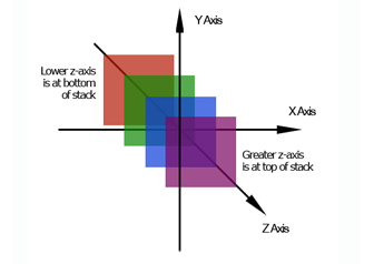
z-index is a CSS property that specifies the stack order of an element.
What does that mean?
z-index allows you to position HTML elements in layers on top of one another. It seems simple at first, but in fact, it’s not.
There are some weird rules that can make the z-index not behave the way you want– even if you set the z-index to the maximum value!
Here I will explain some of the most common reasons that the z-index isn’t working for you.
Natural stacking order of HTML elements
An element with greater stack order is always in front of an element with a lower stack order. That means elements in the same stacking context will display in order of appearance.
Let’s look at an example.
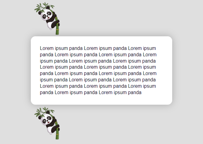
In this example, we have 3 main elements, an image of a panda on top, a content block, and another image of a panda at the bottom.
Here is the HTML markup and corresponding CSS :
<section class="content">
  <div class="top-panda"></div>
  <div class="content-block">
     Lorem ipsum panda Lorem ipsum panda Lorem ipsum panda Lorem ipsum panda
     Lorem ipsum panda Lorem ipsum panda Lorem ipsum panda
     Lorem ipsum panda Lorem ipsum panda Lorem ipsum panda Lorem ipsum panda
     Lorem ipsum panda Lorem ipsum panda Lorem ipsum panda
     Lorem ipsum panda Lorem ipsum panda Lorem ipsum panda Lorem ipsum panda
     Lorem ipsum panda Lorem ipsum panda Lorem ipsum panda
  </div>
  <div class="bottom-panda"></div>
</section>
.content { color: #000; padding: 1rem; width : 500px; margin: auto; }.content-block { background-color: #fff; margin: 0; padding: 30px; min-height: 150px; border-radius: 15px; box-shadow: 0 0 25px rgba(0,0,0,0.25); }.top-panda, .bottom-panda { width: 125px; height: 125px; background-image: url('./panda.png'); background-size: cover; background-position: center center; }
Let our objective in this example is to bring the content block on top of both pandas.
As an initial step, we’ve added some negative margins to the CSS for both panda images, so that they overlap the content-block a bit. Also, make the bottom panda align to the right:
.top-panda { margin-bottom: -30px; }.bottom-panda { float: right; margin-top: -40px; }
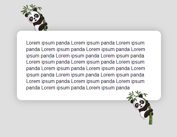
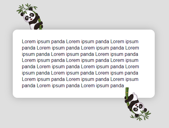
However, it looks like this :
The top panda is indeed positioned underneath the content-block, just like we want. But the bottom panda is positioned on top of the block!
So why is this happening?
This is what I meant earlier. This behavior is due to the natural stacking order on the webpage. These guidelines basically determine which elements will be on top and which will be on the bottom.
Even if elements don’t have their z-index set, there is a reason to which ones will be on top – Element’s stacking order is determined by their order of appearance.
According to this rule, elements that come later in the markup will be on top of elements that come before them.
In our example with the pandas and the content-block, they are obeying this rule. That’s why the first panda is underneath the content-block element, and the content-block is underneath the second panda.
Positioned v/s Unpositioned elements
Note:
z-indexonly works on positioned elements (position: absolute,position: relative,position: fixed, orposition: sticky) and flex items (elements that are direct children ofdisplay: flexelements)
Ok, stacking order is great, but how can we fix the issue in our example?
One of the other guidelines that determine stacking order is if an element has its position set or not.
According to this rule, an element with CSS position property anything other than static will always display on top of unpositioned elements.
So in our example setting the content-block to be position: relative, and leaving the two panda elements unpositioned will put the content-block on the top of the pandas in the stacking order.
.content-block {
     // previous styles
     position: relative;
   }
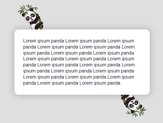
This is how it will look :
CSS properties like opacity or transform
In our example, let us consider rotating the bottom panda upside down, using the CSS transform property.
To accomplish this, we’ll add transform: rotate(180deg) to the bottom panda CSS.
.bottom-panda {
     // previous styles
     transform: rotate(180deg);
   }
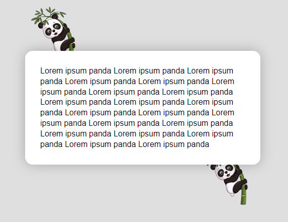
This will rotate the bottom panda, but be displayed on top of the content-block again!
Why is this happening?
Setting the CSS properties like opacity or transform will put the element in a new stacking context.
It means that adding the transform to the bottom-panda element makes it behave as if it had a z-index of 0. Even though it doesn’t have its position or z-index set at all.
Note: If two positioned elements overlap without a
z-indexspecified, the element positioned last in the HTML code will be shown on top.
We never added z-index to the content-block, only added position: relative. Initially, this was enough to position it on top of the unpositioned pandas. But since the bottom-panda element is acting as though it is relatively positioned with z-index: 0, transforming it had positioned it on top of the content-block.
Now, what is the solution?
The solution to this is to set position: relative and explicitly set z-index on the content-block. As it already has position: relative, we want to set only a z-index value greater than 0.
Like this :
.content-block {
     // previous styles
     z-index: 1;
   }
We can also set a z-index for both the panda elements and the content-block. Just need to set a lower z-index on the panda elements.
Now our example will look like this :
In my experience, keeping an eye on these things will solve most of the basic z-index issues.
But sometimes the issue may get a bit complicated when we look at some parent-child elements relationship or deeply nested elements.
Sibling rivalry
Note: An element may come lower stacking context due to its parent’s
z-indexlevel.
A parent element with a z-index will limit the z-index level of its children.
Let’s look at a small example of this.
<div class="blue">
    <div class="violet"></div>
    <div class="purple"></div>
</div>
<div class="green"></div>
div{
width: 100px;
height: 100px;
margin-left: 20px;
}
.blue {
position: relative;
z-index: 2;
background-color: blue;
height: 200px;
}
.violet {
position: relative;
z-index: 4;
background-color: violet;
}
.purple {
position: relative;
z-index: 1;
background-color: purple;
}
.green {
position: relative;
z-index: 3;
background-color: green;
top: -9em;
}This will look like this :
Here the HTML element div.violet will get overlapped by div.green despite having a higher z-index value! Because its parent has a lower z-index value than element div.green.
Thus we can make a note that the z-index only competes amongst sibling HTML elements. The deeply nested HTML element will always get overlapped by a less-nested HTML element with a lower z-index value.
Summary
z-indexcan create overlapping layers on the z-axis.z-indexonly works with positioned elements (any position besides static).z-indexonly competes with siblings HTML elements.


